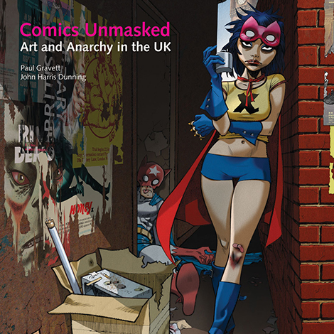
The Principality of Lichtenstein:
From 'WHAAM!' to 'WHAAT?'


Roy Lichtenstein’s grand touring retrospective has arrived at Tate Modern in London and once again his comic book-based paintings have stirred up debate about his relationship with comics and their illustrators, at a time when the graphic novel has been making remarkable strides towards greater literary acclaim, such as the Costa Biography Award to Mary and Bryan Talbot’s Dotter of Her Father’s Eyes. The landscape for comics in Britain is very different from that of 1968, when the Tate Gallery (now Tate Britain) mounted its first Lichtenstein exhibition (photo above, with a photo from 1993 at the Guggenheim, New York). In the accompanying catalogue, Lichtenstein explained, “It was hard to get a painting that was despicable enough so that nobody would hang it. Everybody was hanging everything. It was almost acceptable to hang a dripping paint rag, everybody was accustomed to this. The one thing everybody hated was commercial art; apparently they didn’t hate that enough either.”
Lichtenstein must have relished the irony of magnifying on his projector his re-drawing of a panel of a cornered crook from DC’s Doom Patrol drawn by Bruno Premiani and painting it as his 1963 canvas ‘Image Duplicator’. He was panned as a villain by some art critics, who complained that his paintings were copies, totally lacking in originality, while several comic artists who recognised their panels being used also complained. That aside, Pop Art aroused enormous public enthusiasm. The Tate’s purchase of ‘WHAAM!’ in 1966 was a major news story. His heightening of comics’ sound effects, the medium’s unique system for making the aural visual and incorporating a verbal soundtrack, would influence new British weekly comics from Odhams such as WHAM!, SMASH! and POW! and the camp fight scenes in the Batman television series. From the cover dates of September to December 1965, Marvel went as far as to re-name their comic books ‘Marvel Pop Art Productions’.

The eager embrace of Pop Art is clear from this effusive editorial in SMASH! No. 79 in August 1967:
“All of a sudden (after years of incredible neglect by some eggheads who should have known better) comics are the ‘IN’ thing!! You can see what we mean all around you! The design of up-to-the-minute posters and advertisements, the editorial pages of the big, glossy magazines… all are ‘switched on’ to comic-style art and illustration, to the comic-style use of ‘speech balloons’ to put across the message! And that’s not all! Serious pop art painters find their inspiration from such sources as the ‘good ol’ Power Pack’! The Tate Gallery (and you can’t get much more high-brow than that) recently purchased a high-priced painting by American artist Lichenstein [sic] called ‘WHAAM!’ which is based on a section of an adventure comic strip! That’s the way it is today! Everyone’s getting the message! Comics are FUN! Comics are STYLISH! Comics are TREND! We could have told them a long time ago, right? But isn’t it nice? ... knowing that WE’VE been on the swinging wavelength all along!”
Those celebrations were somewhat premature. Not everyone has tuned into that ‘swinging wavelength’ quite yet! There have been significant advances, of course, within the art world. Just look at those recent solo exhibitions of Moebius, Robert Crumb and Art Spiegelman in major galleries in Paris, Daniel Clowes getting a retrospective at Oakland’s Museum of California, and the Louvre presenting specially commissioned artworks by Enki Bilal. For a few years now, every issue of ArtReview magazine has commissioned a new two-page comic. Tate Publishing itself is bringing out its first graphic novel this month, the astonishing Ambedkar: The Fight for Justice, originally released in India.

Nevertheless, the debates surrounding Lichtenstein’s work and his sources still expose a barely disguised vein of disdain from some in the contemporary fine art world towards comics. Alastair Sooke has written a new short essay, a Penguin Special, entitled Roy Lichtenstein: How Modern Art Was Saved by Donald Duck (a reference to Lichtenstein’s first Disney-inspired painting). In his introduction, Sooke lets slip his low opinion of the early Sixties comic books, notably DC’s war and romance titles, which provided such crucial source material for Lichtenstein’s paintings. Sooke laments, “Where is the subtle brushwork of the Old Masters - the exquisite painterly touch of Titian, Velázquez or Rembrandt? [Lichtenstein’s painting] ‘Masterpiece’ is flat and mechanical, like the comics it is imitating.” Not everyone would agree that the comic-book artwork by Tony Abruzzo or Irv Novick lacked “subtle brushwork” or was “flat and mechanical”. Those ironic qualities were only added by Lichtenstein’s unmistakable handiwork.
There is another irony at work in aggrandising these war and romance panels. Lovers of comic books rightly eulogise the skilled drawing and design on display in the stories Lichtenstein borrowed from, but they are less likely to extol the brilliance of the stories or writing. The uncomfortable truth is that publishers DC were becoming increasingly out of touch with the changing times of the early Sixties. The values of machismo, of bloodless battles, of Americans always winning and always being in the right, would start to ring hollow as its young men became increasingly embroiled in the war in Vietnam. Similarly, the enfeebled, petal-like, lovestruck heroines of the romance comics, regularly bursting into tears and stuttering with uncertainty, failed to acknowledge the emerging independence of women and the onset of feminism. Their simplicity and outdatedness were ripe for being mocked and in many ways deserved it. It should be stressed that American comic books were no more guilty of perpetuating these sexist stereotypes than a good deal of the mass-market books, Hollywood movies or television dramas and soap operas of this period. The big difference was that comic books did this not in film or prose but in hand-made texts and pictures and with such succinct, graphic power.

Returning to Sooke’s book, there’s another skewed demeaning of the comic books, when he writes: “The War paintings were inspired by trashy publications such as the All-American Men of War comics books that were popular during the Fifties. Lichtenstein transformed the illustrations in their pages into exhilarating images of ice-cool jet pilots in dogfights, submariners unleashing torpedoes, and heavy weaponry surrounded by onomatopoeic sound effects such as TAKKA TAKKA and BRATATAT!” One might wonder if the adjective “trashy” is really necessary or accurate here? And some would argue that those source images did not need Lichtenstein to transform them into something ‘exhilarating’, but were already quite exhilarating enough in their original form on the comic books’ pages, as shown by Lichtenstein’s own clipped page (above) from All-American Men of War #89 (February 1962).

To be accurate, in the case of ‘WHAAM!’, Lichtenstein did not follow Irv Novick’s panel completely but used it as the underpinning composition and for one sound effect and narrative caption. He then sketched out a remixed version (above), replacing Novick’s side-view of the attacking plane on the left with a sharper, clearer plane at an angle, taken from the following issue, All American Men Of War #90, from the story ‘Wingmate of Doom’, panel 3 on page 11, drawn by Jerry Grandenetti (below).

He also switched the relatively small exploding plane in the distance on the right with another, by flipping through the same issue of All-American Men of War and picking out a different plane. David Barsalou, compiler of the invaluable resource Deconstructing Lichtenstein, thinks it could be taken from panel 3 on page 3 of the Russ Heath-illustrated story ‘Aces Wild’ (below). It could well have looked to Lichtenstein (mistakenly) as if its right wing is shearing off diagonally. This looks to me looks more probable than Barsalou’s other suggested source for the enemy plane, literally sitting over the page, panel 6 on page 12 of Novick’s ‘The Star Jockey’, as its nose cone shape is different and it lacks that breaking wing, the sort of creative idea and drawing that Lichtenstein would not have added to Novick’s design.

So if we also want to acknowledge the writing (the image would not have been drawn without the initial script probably by editor Robert Kanigher) and the lettering, the proper credits should really read: ‘Roy Lichtenstein after Robert Kanigher, Irv Novick, Jerry Grandenetti, Russ Heath and Gaspar Saladino.’ If we could ever determine who coloured that original panel, that name could be added on the end! ‘WHAAM!’ may be about the most famous, most reproduced single panel from a comic book, but it has been totally removed from its context as merely one of 67 panels across a 13-page story. Few people know that the pilot firing those missiles is a Native American, ‘Johnny Cloud, Navaho Ace’, who receives predictions of his future through ‘smoke pictures’. And that ‘WHAAM!’ sound is only one of 46 sound effects in this noisy tale! To restore its context, the whole of ‘The Star Jockey’ is readable below - just click on the images to enlarge them.


‘The Star Jockey’
Click images to enlarge.
Back in 1993, Watchmen co-creator and artist Dave Gibbons recorded a short piece for the Beeb as part of The Great Picture Trail series, choosing a Lichtenstein as his subject (see the clip below).
On February 24th 2013, Gibbons was invited back to be interviewed by Alastair Sooke who fronted an hour-long BBC4 documentary on Roy Lichtenstein. In what was largely a puff piece for the Tate Show with little questioning or controversy, the only interviewee to raise important issues was Dave Gibbons. Here are the highlights of Sooke’s and Gibbons’ discussion, centred around and standing in front of the 1963 canvas ‘WHAAM!’. Sooke began by asking Gibbons about accusations that Lichtenstein was a plagiarist and referred to an article headline from the period, ‘Pop Artists All Copycats’.
Dave Gibbons: “I would say ‘copycat’. In music for instance, you can’t just whistle somebody else’s tune or perform somebody else’s tune, no matter how badly, without somehow crediting and giving payment to the original artist. That’s to say, this is ‘WHAAM! by Roy Lichtenstein, after Irv Novick’.”

Sooke shows the original comic book, All-American Men of War #89 (bought for £5.95 - “a bargain!”) which includes the painting’s compositional source panel.
Alastair Sooke: “Lichtenstein has not only transformed it, he’s seriously improved it.”
Dave Gibbons: “I would disagree. This to me looks flat and abstracted, to the point of view that to my eyes it’s confusing. Whereas the original has got a three-dimensional quality to it, it’s got a spontaneity to it, it’s got an excitement to it, and a way of involving the viewer that this one lacks. For instance, the explosion here just looks to me like a collection of flat shapes, whereas the explosion in the original, because there are no lines in there, because it’s all left to the colour, seems to me to have to me much more of the quality of an explosion.”
Sooke disagrees, considering the original comic book explosion a bit “weak and measley”, whereas Lichtenstein’s version, “considered as a painting and not as a piece of comic book art, but as a piece of art, is far more successful than if this had been reproduced and placed on a wall. For a number of reasons: he’s got rid of extraneous details like the planes on either side. He’s removed the mountain, which I think is an unfortunate compositional device. He’s made the balance of the explosion on the right and the plane much clearer. It is much more balanced, they are more equal. I think those are several compelling reasons why formally this is a much more successful image than the source.”
Gibbons: “Well, I think there is a fundamental error in what you’re saying, which is that in fact a comic book is not anything to do with a single image, it’s to do with a series of images and it’s the images in juxtaposition to one another which give them their power. This is like a quotation, it’s like three notes out of the middle of a symphony.”
Sooke concedes and agrees with this and goes on: “But this [Lichtenstein’s WHAAAM!] we have to think of as a painting. Does it work as a piece of art in its own right? If it simply imitated this panel here, I’m suggesting, I think that it wouldn’t work as such an effective painting as in fact it does.”
Gibbons: “I bet you that if that Irv Novick panel was shown that size, it would have a huge graphic power of its own and it would have a cohesiveness, whereas this, to me, isn’t cohesive. Everything interesting about that [comic book] image, which is a representation of three-dimensional space, of a real event happening, to me is just flattened…
Sooke: “It’s an abstract painting. He said he wanted to hide the record of his hand, he’s bouncing off a previous generation of artists, abstract painters, people like Jackson Pollock, who were all about gesture, expression. He’s saying ‘I want it to appear flat and impersonal and mechanical, because that is the world I live in. And in fact that’s what I want to get across.’ So everything you’re saying, I think, you could argue, plays into his hands. Have I convinced you at all?”
Gibbons: “I’m afraid you haven’t convinced me at all. From the point of view that I come from, I find there’s something slightly dishonest about it, there’s something that is trying to be ironic that I think doesn’t actually work. It seems to be doing a disservice to comic art because of that.”
Sooke: “Although Lichtenstein’s work is so phenomenally popular, you could argue that he’s on the side of comics.”
Gibbons: “Yes, I’d have to agree, to try and find a point of harmony, that in the Sixties, for a short while, the mighty Marvel Comics group rechristened itself ‘Marvel Pop Art Productions’, because stuff like this in the eyes of ‘culture’ had said, ‘Hey, these aren’t just comics for kids, these could be the next big artistic wave.’ It lasted about three or four months, I think.”

Sooke: “Be honest. Is there any part of you that is narked by the fact that I could buy this comic book for £5.95 and clearly, if this [painting] ever came up on the market, it would be worth tens and tens of millions of pounds.”
Gibbons: “It doesn’t nark me at all. I mean, this is worth, to me, far more than that.”
Sooke: “What, for real? If you were offered this, you wouldn’t have this? You’d take the Irv Novick original?”
Gibbons: “Absolutely.”
It’s revealing that Sooke is genuinely surprised that Gibbons values the comic book far higher than the painting. After all, so-called ‘commercial art’, like comic books, can often be poorly paid and done in part out of a love of the medium, whereas so-called ‘fine art’ can sell for millions, and so in many ways is surely far more ‘commercial’. The art world is the art business and the real star-maker lurking in the wings was Leo Castelli, Lichtenstein’s gallerist from the early Sixties, who saw his chance and lucked out with big-time with these paintings. Both men made the most of their opportunities.

What are the legacies of Lichtenstein? One is the never-ending recycling of his approach, especially the romance images, by the laziest of art directors, designers and illustrators. Copycats of the copycat. Having just flown back from Barcelona, I found the Easyjet in-flight magazine included a supposedly rib-tickling feature about a blokey man being expected to ‘Survive A Girly Ski Holiday In The Alps’. And accompanying it were several sub-Lichtenstein-esque illustrations like this one above. We’re in 2013 and this worn-out idea is still being pushed at us after fifty years. Oh, the irony!
Another disappointing legacy is the continuing widespread public assumption that Lichtenstein’s paintings still sum up and represent what comics art looks like today, when the range of media, techniques and approaches is actually more diverse than ever. Astonishingly, I heard about someone who owns a print of ‘WHAAM!’ and had absolutely no idea that it came from comic books at all! When they were told, not only were they horrified, but they also treasured the piece less as a result. The stigma of ‘despicable’ comics lingers on.

Dave Gibbons’ ‘WHAAT?’
Click image to enlarge.
It’s high time comics creators themselves re-appropriated Roy’s original sources and turned the spotlight back onto the brilliant, unsung illustrators who originated them. In that spirit, Dave Gibbons has responded to Sooke’s art-criticism that Lichtenstein’s re-mix was “more successful” than Novick’s original composition by making ‘WHAAT?’, his own appropriation of the panel and replacing none of Novick’s original elements (above). Gibbons has also stayed true to the full original script in both caption and balloon, probably written by editor Robert Kanigher, and to the design and placement of letterer Gaspar Saladino’s lettering and sound effects. Gibbons wittily turns WHAAM!’ into ‘WHAAT?’ and the missing onomatopoeia of the missile firing, ‘WHOOSH!’, into the telling question, ‘WHOOSE?’. ‘WHAAT?’ even at this scale proves that there is every bit as much graphic power and compositional artistry in the source material. And do enlarge this masterpiece further and you’ll discover the real secret behind those red Benday dots.
In an email to me, Gibbons explains, “Glad you like my Novick re-purposing. I drew the piece in Adobe Illustrator using vectors, so it can be enlarged to any size and still stay pin-sharp. I intend to do a HUUGE stretched canvas version. The idea would be to present it in as much the same way as the Lichtenstein version as we could. I would then sell it and donate the profits to the Hero Initiative.” The public get their first chance to see this one-and-only giant print of ‘WHAAT?’, when it goes on show on Saturday April 20th 2013 at Comica Festival’s day of events and exhibits at Central Saint Martins College of Art & Design near King’s Cross, London, displayed in The White Lab from 11am to 7pm, admission free. Gibbons is also plans a signed, limited edition of smaller prints of this piece to raise funds.
Hero Initiative is an appropriate charity, as its proceeds go to help comics professionals who need financial assistance, often due to the shoddy work-for-hire contracts and lack of medical and other benefits typical of America’s comic-book corporate giants. As their mission statement explains: ‘Hero creates a financial safety net for yesterdays’ creators who may need emergency medical aid, financial support for essentials of life, and an avenue back into paying work. It’s a chance for all of us to give back something to the people who have given us so much enjoyment.’ However much this does raise, highly worthwhile and of real help though it may be, it will be a mere sneeze compared to the millions reaped by the ‘Big Two’ U.S. publishers to this day, and compared to the moolah stashed away by Castelli and Lichtenstein themselves.
The debate over Lichtenstein’s legacy does not end here. His success, his getting away with turning supposedly anonymous ‘found’ comic art into high-priced paintings, continues to directly encourage others to do the same. But there is a difference - comics are no longer uncredited, trashy mass culture, and what worked as a lucrative schtick back in the Sixties art world is now largely drained and devoid of any shock value or irony. But this has not stopped several successors, more Copycats of the Copycat, to do much the same as Lichtenstein.

The Icelandic artist Erró, real name Gudmundur Gudmundsson, for example (shown above), has been throwing together comics references from far and wide into his tumultuous tableaux and amassing fame and fortune in the process. But he met his match when he crudely copied a classic Tank Girl cover by Brian Bolland and mixed it with some other ‘found’ material from a Communist propaganda image from China. You can read Brian’s well-reasoned open letter to Erró here. It’s worth noting that this cover was signed by Bolland and that signature was of course removed.
Here’s how Brian Bolland sums it up: “I’ve very much liked your earlier collages The many elements have created a new whole, but I think your “Tank Girl” print is not about Erró’s choice of image juxtaposition. It’s dominated by my work. I think the selling point of your poster is my work. The way that promotional photo of you with the Tank Girl poster behind you is cropped proves the point. You’ve moved well away from “fair use” into plagiarism. By removing my name from the image you show you don’t really care about the artists whose work you steal. Your work sneers at and perpetuates old stereotypes about the kind of work done by me and people I respect – and does it no good whatsoever. Your work is about “Recontextualizing”. Ie. taking something out of one place and putting it somewhere else, thereby showing it in a different (possibly ironic) light. In view of the fact that your poster of my Tank Girl is selling for 600 Euros, I suggest you stop selling it and I invite you to recontextualize the money you got from the sale of it out of your bank account into mine.”
In this instance, the publishers of the 20 copies of a print based on Erró‘s offending painting removed the remaining 12 copies from sale (three were sold and give were already given to the artist). Forgive the pun, but it remains to be seen if he will see the Erró of his ways.


But there are plenty more fine artists repeating Lichtenstein’s approach even now and often doing very little to alter or improve on the comic art itself. At the Comic Iconoclasm exhibition in 1987 at London’s Institute of Contemporary Arts (and curated by Sheena Wagstaff, co-curator of the Tate’s current Lichtenstein retrospective), the American artist Jerry Kearns exhibited a work that simply spliced together panels by Bernie Wrightson and Brian Bolland (his Judge Death) and made them big. Kearns has diversified since, but recently was offering prints for sale obviously based on Judge Anderson and on a classic Judge Dredd comic book cover, both by Bolland, with no acknowledgment (above). More recently, mediocre French-born artistes ‘ROD’, represented by the Paris Gallery Arludik, who work with comics artists and ought to know better, and Benoit Paré, showing through the Kapopoulos Gallery in Greece, have both plagiarised Bolland’s artwork without crediting him. Bolland is not the only victim of these shameless swipes, but he does seem particularly prone to them, no doubt because his work is so accomplished and striking. At least now, Paré has added a credit to Bolland on his site for this Wonder Woman cover (below), but not to plenty of his other sources, including George Perez, also from Wonder Woman. Take a look and make your own mind up.

Can the art world continue to turn a blind eye to this? Perhaps it can, as long as these works sell and nobody makes an issue of it. But is it now time for this practice to stop or at least be debated, for the sake of comics and for the sake of contemporary art? One idea might be to regulate this process, perhaps requiring artists to pay for their samples in the same way that musicians already do. In 2008 British designer and comics creator Rian Hughes commented eloquently about the issue of plagiarism of pop culture imagery and is now responding by co-ordinating an exhibition called Image Duplicator from May 16th to 31st at Orbital Gallery, London, in which he is inviting comics artists to follow Dave Gibbons’ lead and consider such questions as: ‘Is this an act of brilliant recontexturalisation? The elevation of commercial “low” art to “high” art? Art world snobbery? Artistic licence? Cultural annexation? Gallery shortsightedness? Or something else?’. And then to share their views by making new works - Rian sets out the brief as follows:
“Every interested comic artist should “re-reappropriate” one of the comic images Lichtenstein used, and rework it, using some of their ‘commercial art’ drawing skills, to warp and twist it into something interesting and original, and in the process to comment on this type of appropriation. The IMPORTANT thing to stress is that you’d be going back to the source material and re-reappropriating Coletta, Novick, Kirby et al – NOT copying Lichtenstein, as we don’t want copyright issues from the Lichtenstein estate. Take Back the Art! Choose your images here, at this handy “compare and contrast” site: Deconstructing Lichtenstein. Please give credit to the original artist: “Artist Name after Irv Novick”, for example. The new work could be shown next to the original, so viewers could compare and contrast. See this as a celebratory, positive show which aims to get the point across that the original artists deserve credit and respect.”
In a further twist, one of the principal illustrators of DC’s war comic books, Russ Heath, is currently being honoured with a major one-man retrospective gallery exhibition at the Casal Solleric in Palma Mallorca, Spain. Flesh and Steel: The Art of Russ Heath runs from January 24th to April 7th, curated by Florentino Flórez Fernández (see clips above), with a lavish catalogue. While the curator understandably wanted to downplay the connections between Heath and Pop Art, to concentrate on Heath’s own artistry, the exhibition does include some important pages of his original Sixties war comics artwork, and specifically one of the sources for Lichtenstein’s ‘Okay Hot Shot’ painting from G.I. Combat #91. Heath’s intense pilot in the heat of combat appears in a panel from page 7 of the story ‘The Tank and the Turtle’ and is shown below from the original line artwork.

Five decades on, the position of comics within culture has transformed enormously today, so it is high time for the comics world and the art world to properly debate these issues, and to celebrate these hugely talented but still largely ignored visual storytellers. From October 22nd 2013 to February 9th 2014, London’s Barbican Centre will host a revised and expanded version of the touring exhibition Pop Art Design which includes a number of Lichtenstein pieces, while in summer 2015 Tate Modern has lined up an international survey entitled The World Goes Pop. Perhaps these exhibitions will provide an opportunity to open this much-needed real dialogue and discussion to reappraise comics art.
To close with a humorous flashback to the Swinging Sixties, here’s the final page from a Little Annie Fanny episode from a 1967 issue of Playboy by Harvey Kurtzman with cohorts Will Elder and Russ Heath. Our hapless, often topless or clothes-less heroine finds herself modeliing for classically trained painter Duncan Fyffe Hepplewhite, but when the public and critics fail to buy his paintings, he decides to go ‘modern’ and paint copies of famous works. “I’m loaded! I’m in style: my paintings are fashionable! I swing with Kline! De Kooning! Lichtenstein! and all them cats!” In the twist ending, he is handcuffed and dragged off to jail for ten years. Heath may have taken some satisfaction is contributing to this satire and perhaps making up his own Lichtenstein canvas in the final panel.
Little Annie Fanny by Kurtzman, Elder & Heath
Click image to enlarge.